- 快召唤伙伴们来围观吧
- 微博 QQ QQ空间 贴吧
- 文档嵌入链接
- 复制
- 微信扫一扫分享
- 已成功复制到剪贴板
xpages和bootstrap
展开查看详情
1 .Xpages & Bootstra p Johan Poot | Senior Consultant | Primaxis www.primaxis.com.au
2 .Agenda What is bootstrap Required files Viewport Bootstrap Grid Basic Grid Examples Create useful custom controls Add navigator Add View Add Form Add modal
3 .A quick Introduction My name is Johan Poot 17 years’ experience working with IBM technologies, including over 6 years working with XPages . Consultant for Primaxis (formerly Dr Notes) for nearly 4 years and specialising in Domino Application Development. 14 years experience within private organisations as a business/system analyst doing domino development, system analysis and project management.
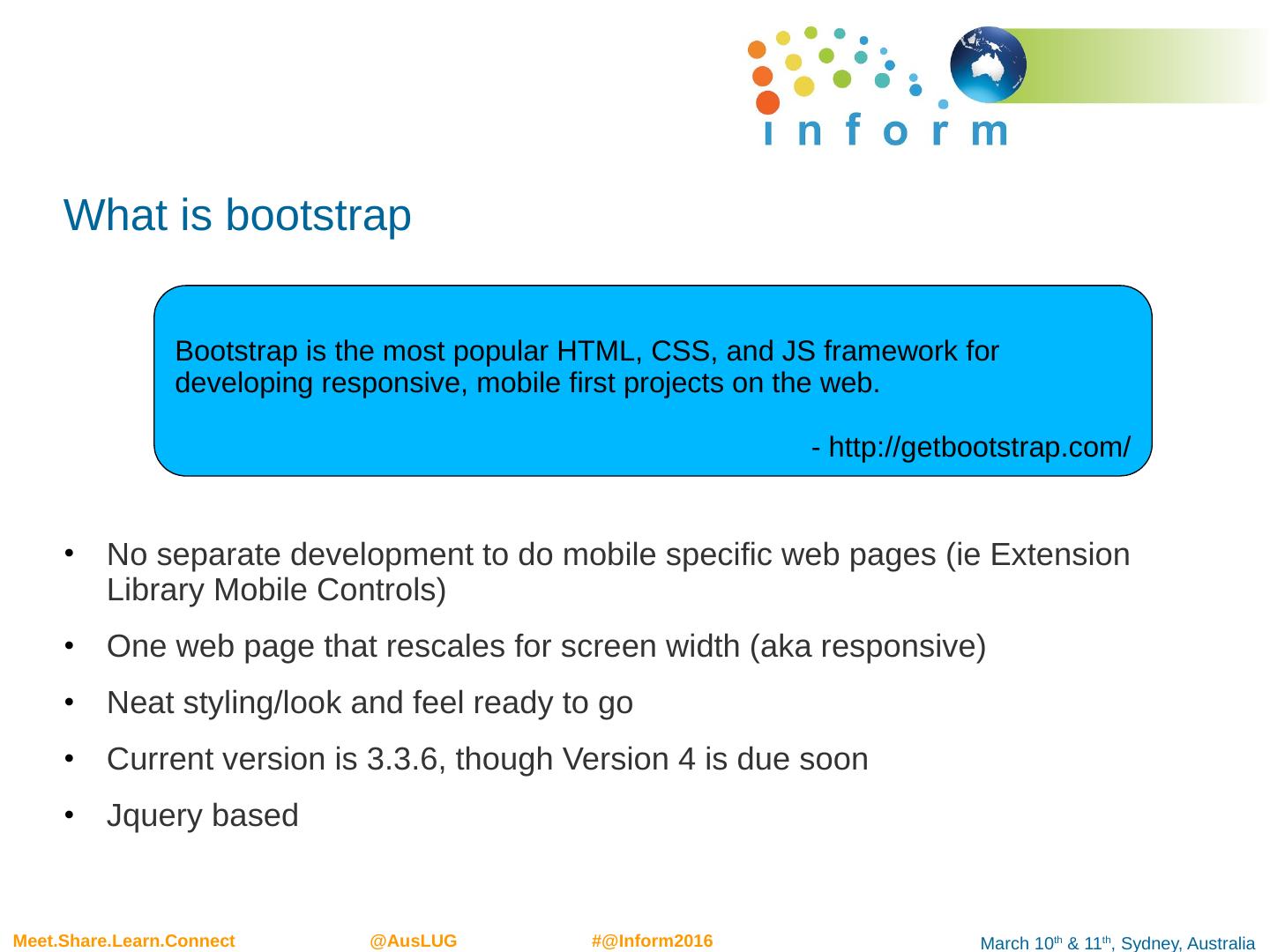
4 .What is bootstrap No separate development to do mobile specific web pages ( ie Extension Library Mobile Controls) One web page that rescales for screen width (aka responsive) Neat styling/look and feel ready to go Current version is 3.3.6, though Version 4 is due soon Jquery based Bootstrap is the most popular HTML, CSS, and JS framework for developing responsive, mobile first projects on the web. - http://getbootstrap.com/
5 .Skills Required Basic web page development skills – Bootstrap is not complex Understanding of HTML DOM Essentially you work mainly with DIVs CSS There are lots of Bootstrap classes to learn, but they are well referenced Jquery You don’t really need to know jquery , but it comes in handy. You can of course use Dojo instead or basic javascript but would involve more lines of code Xpages Naturally Xpages , especially the concept of server side and client side HTML, ie < xp:div > vs <div>
6 .Required Files Listed below are the required files. Use the Package Explorer to upload them into your database
7 .Bootstrap files Copy (or import) your files into the WebContent folder
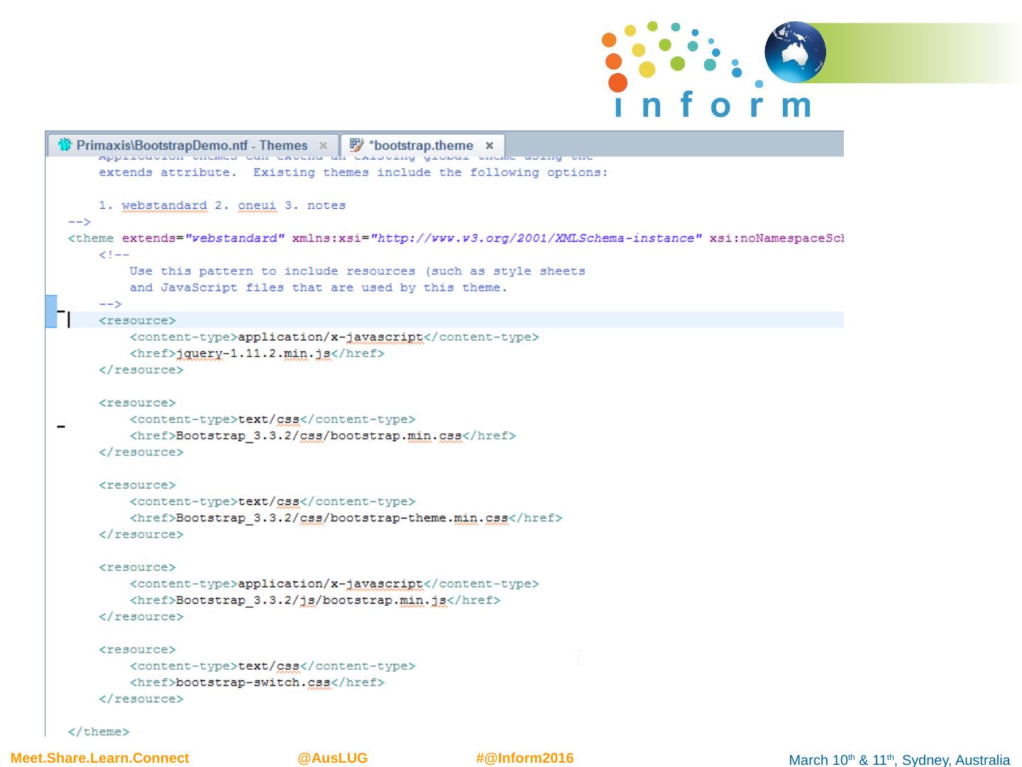
8 .Add jquery js library Copy import your jquery library You can also import into Script Library folder if you prefer Next create a theme and include your files
9 .Include your files Best done by adding in themes
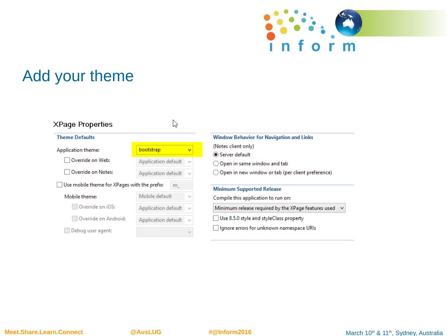
10 .Add your theme
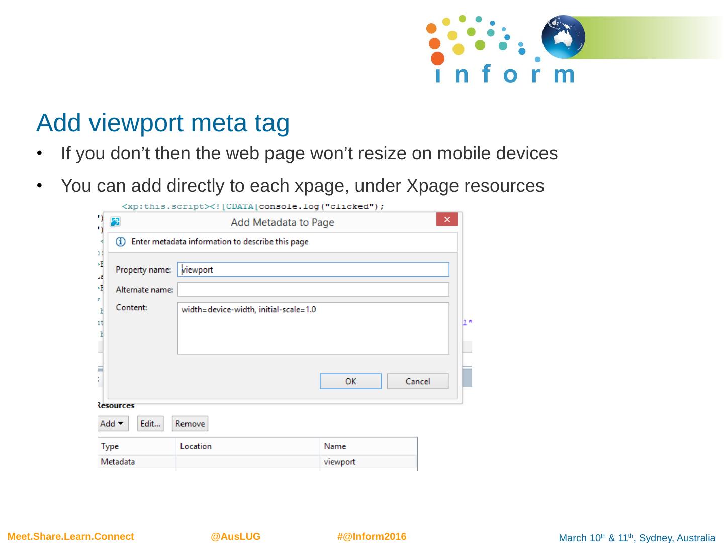
11 .Add viewport meta tag If you don’t then the web page won’t resize on mobile devices You can add directly to each xpage , under Xpage resources
12 .But even better, add to theme
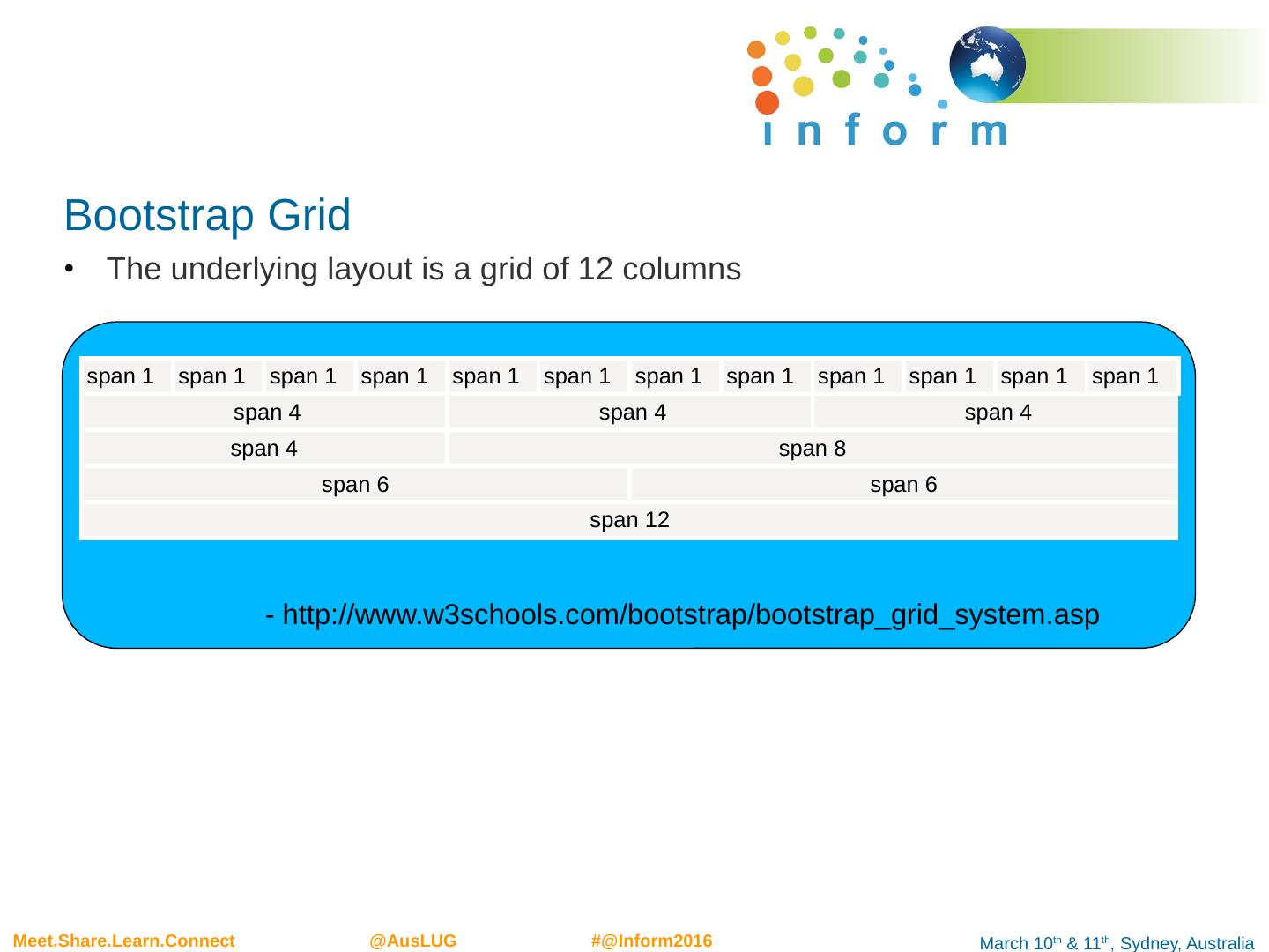
13 .Bootstrap Grid The underlying layout is a grid of 12 columns span 1 span 1 span 1 span 1 span 1 span 1 span 1 span 1 span 1 span 1 span 1 span 1 span 4 span 4 span 4 span 4 span 8 span 6 span 6 span 12 - http://www.w3schools.com/bootstrap/bootstrap_grid_system.asp
14 .Screen size denotation Four classes that represent screen size xs Extra Small, ie Mobile Phones, <768px sm Small, ie tablets, >=768px md Medium, ie typical desktops, >=992px xl Extra Large, ie large desktops, >=1200px Grid system columns are represented as follows, col-<size>-<span> ie col-sm-6 Means for small devices and up, span 6 columns For small devices would fill the full length of screen
15 .Nestable Columns can be nested, which means you can divide up the screen as much as you want really col-md-6 col-md-6 col-md-6 col-md-6 col-md-6 col-md-6 col-md-6 col-md-6 col-md-6 col-md-6 col-md-6 col-md-6 col-md-6 col-md-6
16 .Examples < div class= "row"> <div class= "col-sm-6" style=" background-color:yellow ;"> DIV ON THE LEFT col-sm-6 </div> <div class= "col-sm-6" style=" background-color:pink ;"> DIV ON THE RIGHT col-sm-6 </div> </ div>
17 .That’s nice but what about using with Xpages Been typing html directly in Xpages Source, can add bootstrap classes directly to xp controls < xp:panel styleClass = "row"> < xp:div id= "div5" styleClass ="col-sm-6" style=" background-color:yellow ;"> xp:div ON THE LEFT col-sm-6 </ xp:div > < xp:panel id= "div6" styleClass ="col-sm-6" style=" background-color:pink ;"> xp:panel ON THE RIGHT col-sm-6 </ xp:panel > </ xp:panel >
18 .Basic HTMl Layout IMPORTANT <div class=“container”> All bootstrap content should be encapsulate by this div <div class="container"> <form role="form"> <div class="form-group"> <label for="email">Email:</label> <input type="email" class="form-control" id="email" placeholder="Enter email"> </div> </form> </div>
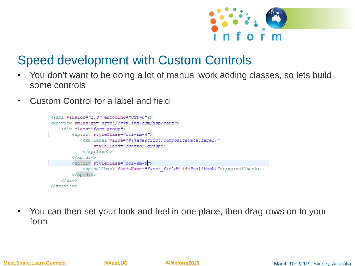
19 .Speed development with Custom Controls You don’t want to be doing a lot of manual work adding classes, so lets build some controls Custom Control for a label and field You can then set your look and feel in one place, then drag rows on to your form
20 .Custom Controls Listed below are some basic custom controls boot_layout – div with container class and Editable Area boot_nav – div with navigation bar boot_panel – optional, panel header and body boot_row – row with two columns for field and label
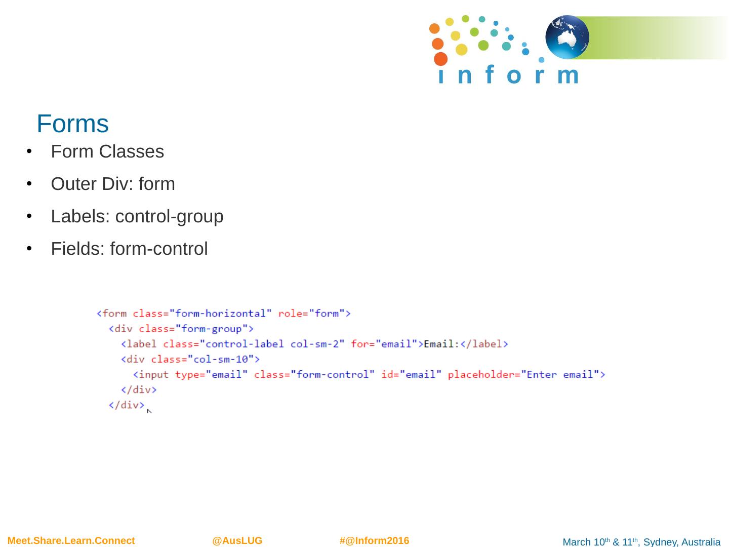
21 .Forms Form Classes Outer Div : form Labels: control-group Fields: form-control
22 .Drag rows on to xpage Put a div to contain all your rows < xp:div styleClass = "form-horizontal“> … </ xp:div > Example Drag panel, add class “form-horizontal” (also form-inline) Drag boot_row Drag fields into facet controls
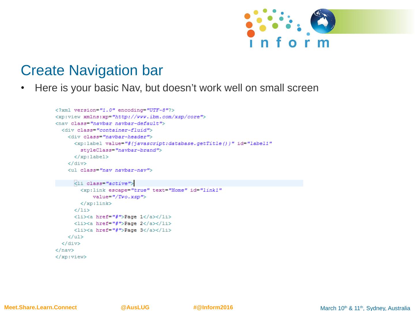
23 .Create Navigation bar Here is your basic Nav , but doesn’t work well on small screen
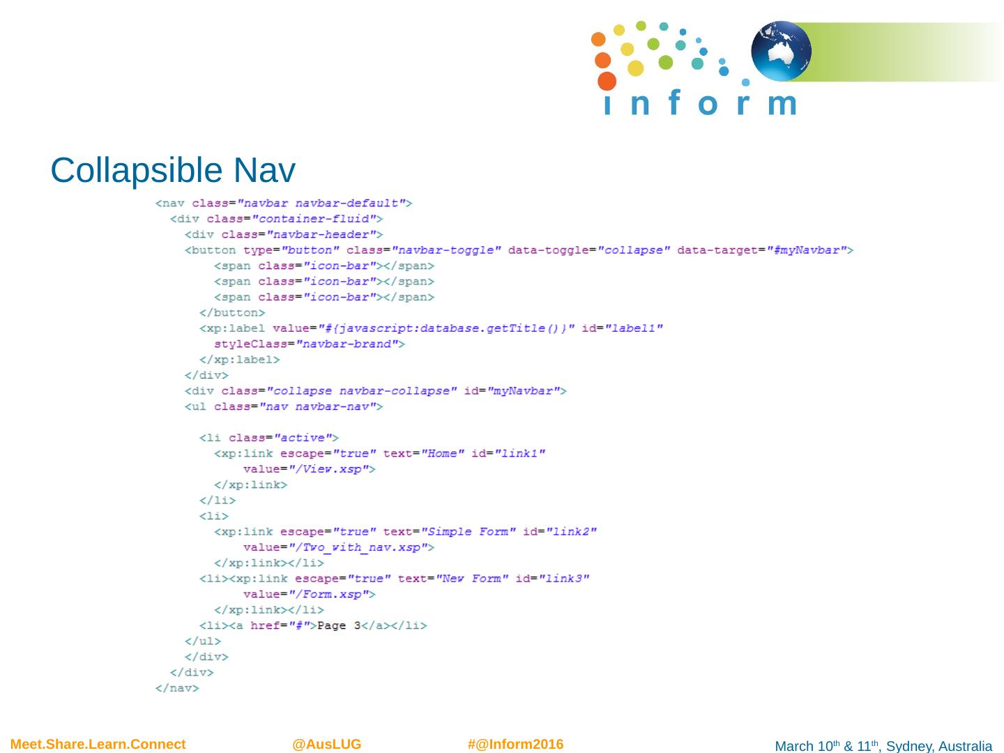
24 .Collapsible Nav
25 .Create View Container Lets look at a View Container control Drag on View Container Show on web page Add .table class (can also use table-striped, but need to add inner table class) Show on web page hidden.xs to hide columns on small devices
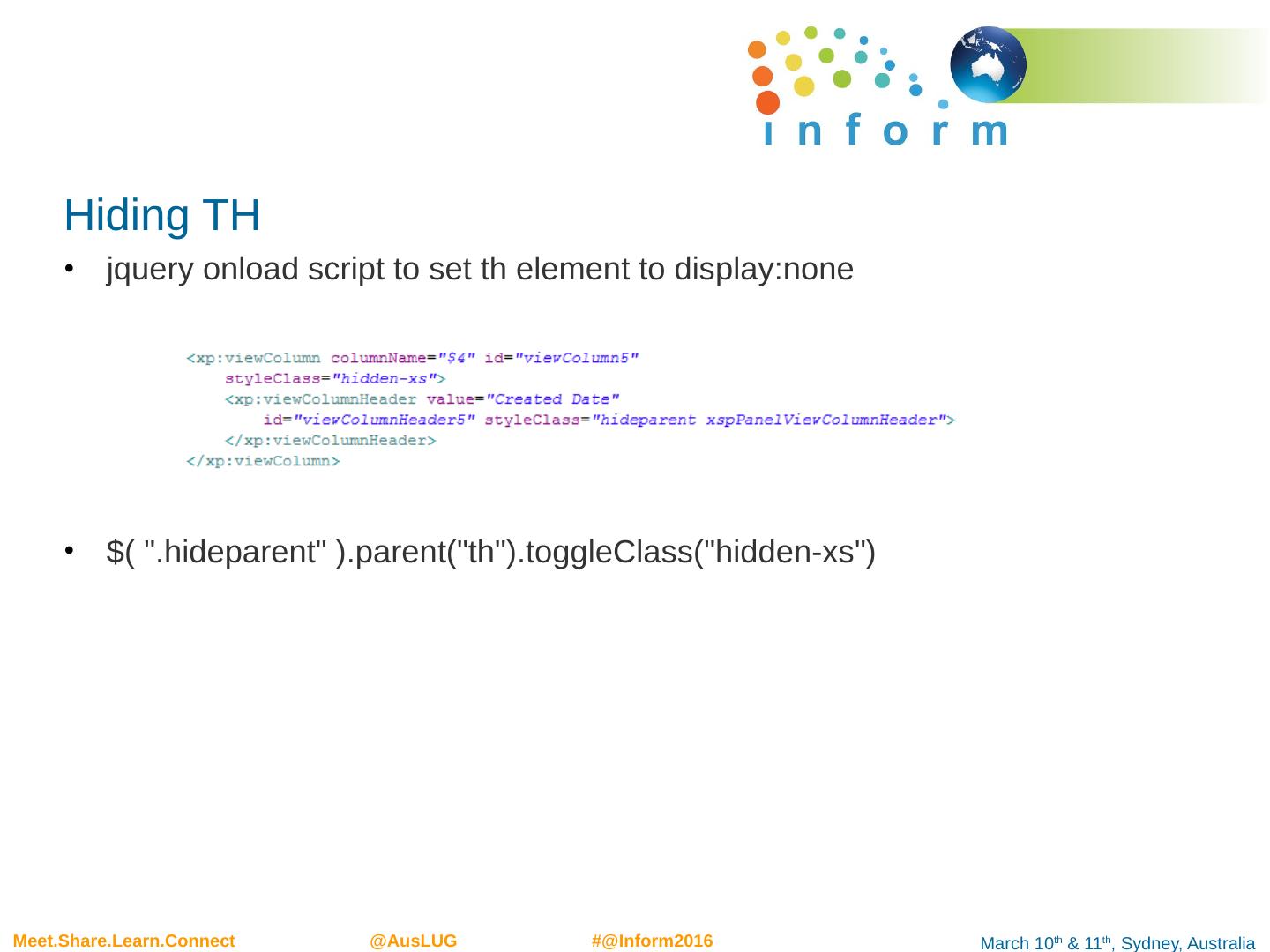
26 .Hiding TH jquery onload script to set th element to display:none $( ". hideparent " ).parent(" th "). toggleClass ("hidden- xs ")
27 .Add Form xpage I prefer to create form on a custom control Add save and exit button btn btn -default btn -primary btn -success, etc
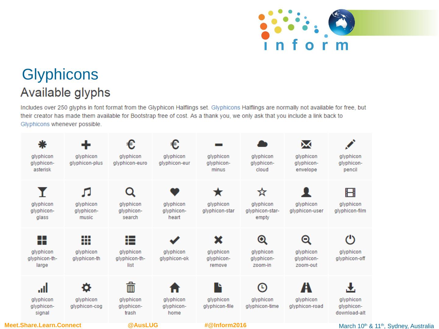
28 .Glyphicons Special font for showing icons
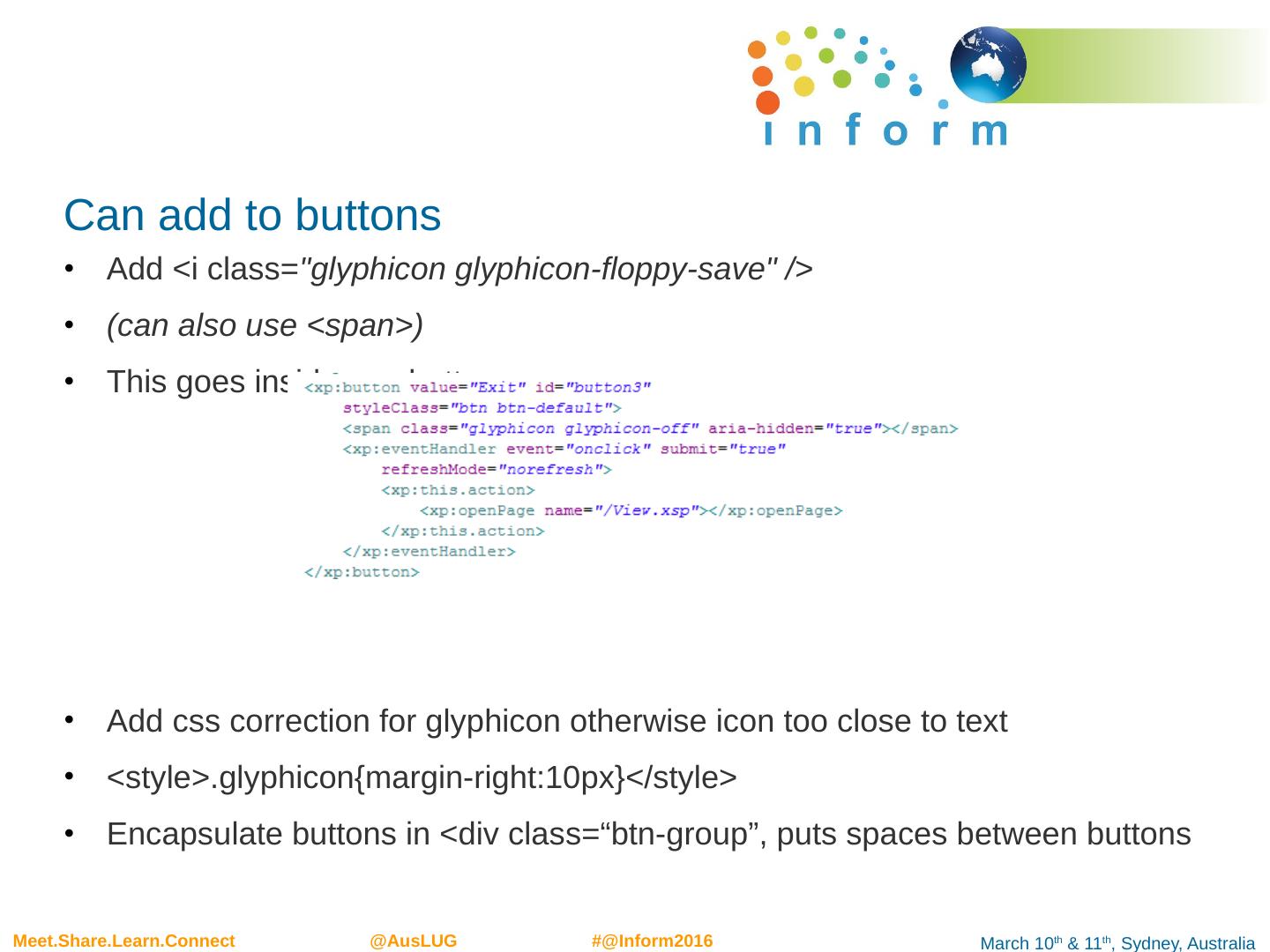
29 .Can add to buttons Add < i class= " glyphicon glyphicon -floppy-save" /> (can also use <span>) This goes inside < xp:button > Add css correction for glyphicon otherwise icon too close to text <style>. glyphicon {margin-right:10px}</style > Encapsulate buttons in <div class=“ btn -group”, puts spaces between buttons


