- 快召唤伙伴们来围观吧
- 微博 QQ QQ空间 贴吧
- 文档嵌入链接
- 复制
- 微信扫一扫分享
- 已成功复制到剪贴板
CSS最佳实践
展开查看详情
1 .CSS BEST PRACTICES
2 .Lecture Overview Understanding grid frameworks CSS design best practices Stylesheet organization Fixed vs. fluid layouts Look at existing templates
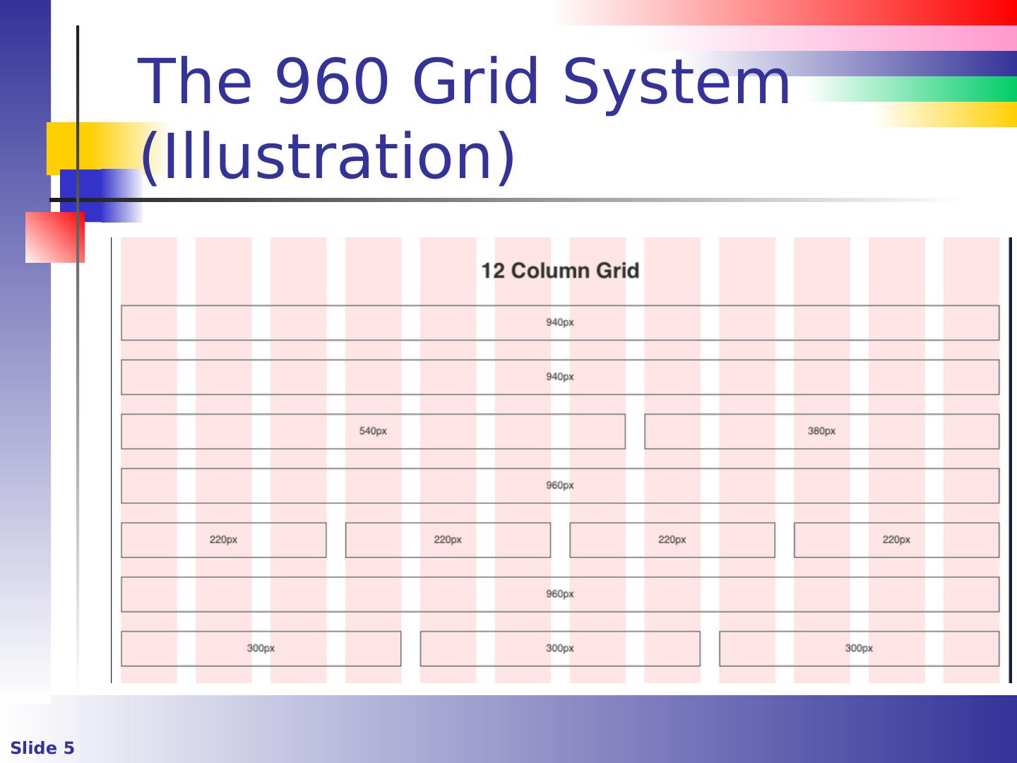
3 .The 960 Grid System (1) It was a de facto standard for standardized layouts (Nathan Smith is credited with its creation) The grid is typically structured as follows Total width 960px / Total content area is 940px 12 columns @ 60px each Each column has 10px left & right margin which forms 20px of gutter space As screens get wider, some consider the 960 grid obsolete
4 .The 960 Grid System (2) There are 12, 16, and 24 column versions Download from http://adapt.960.gs /
5 .The 960 Grid System (Illustration)
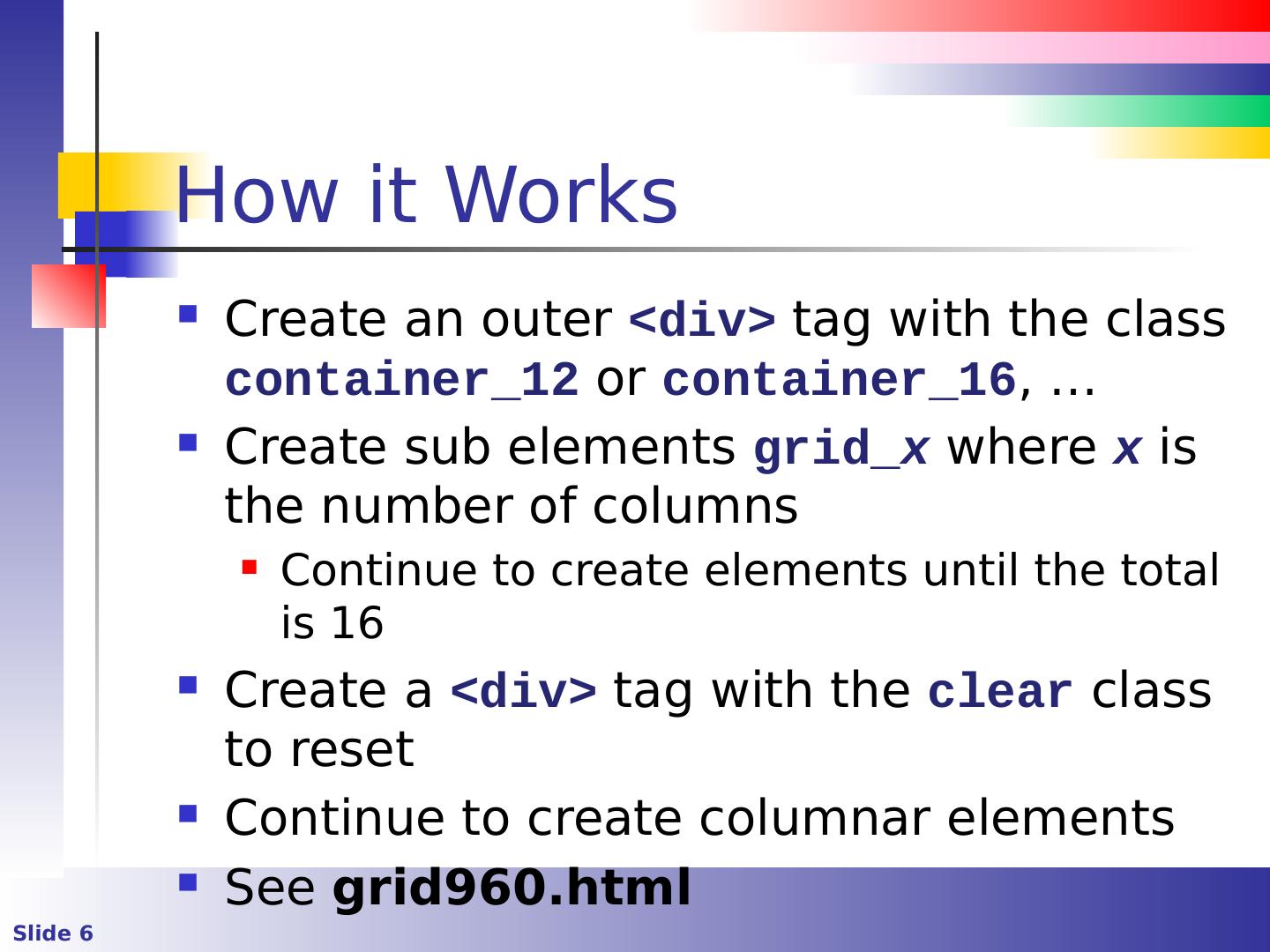
6 .How it Works Create an outer <div> tag with the class container_12 or container_16 , … Create sub elements grid_ x where x is the number of columns Continue to create elements until the total is 16 Create a <div> tag with the clear class to reset Continue to create columnar elements See grid960.html
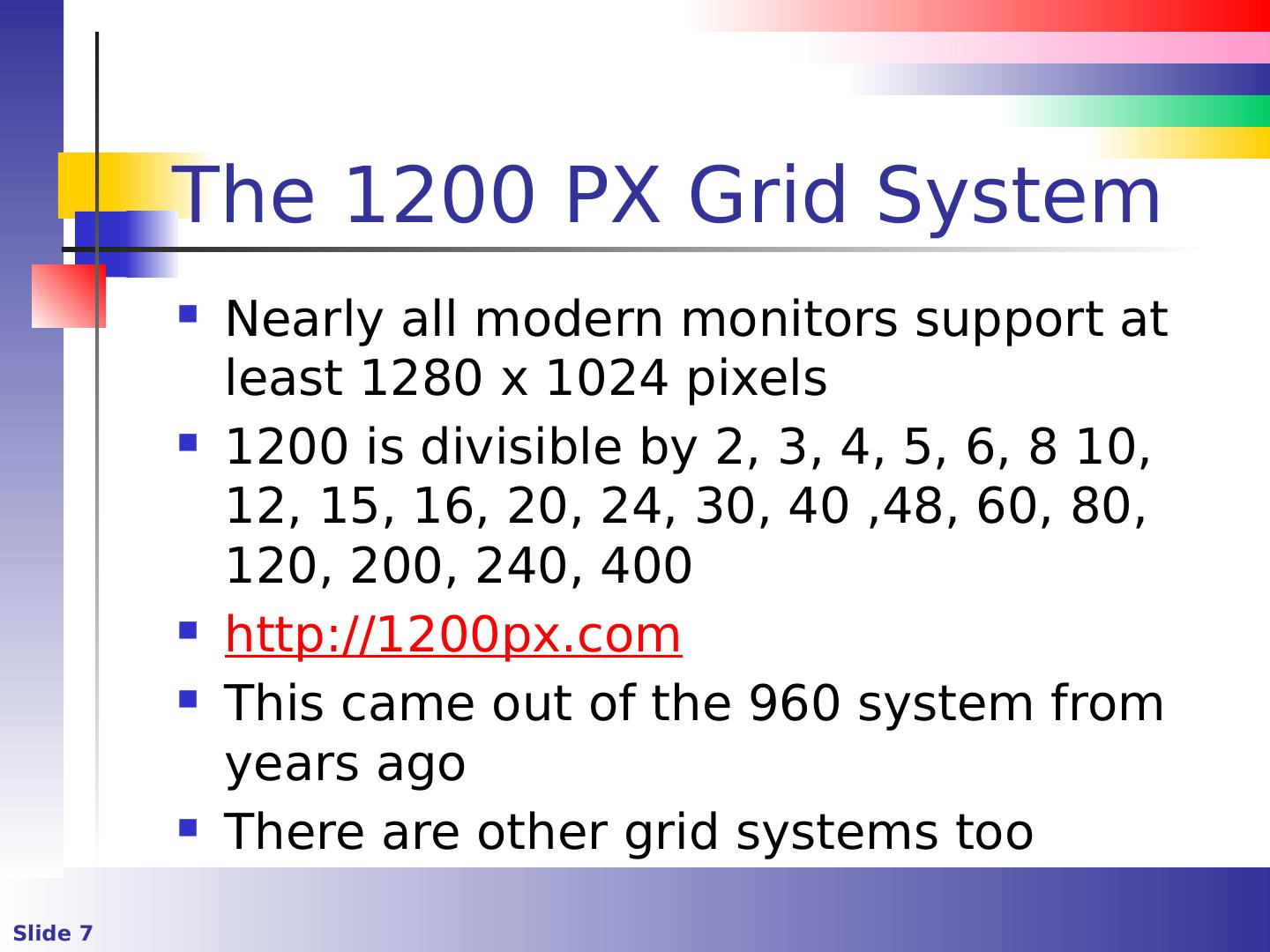
7 .The 1200 PX Grid System Nearly all modern monitors support at least 1280 x 1024 pixels 1200 is divisible by 2, 3, 4, 5, 6, 8 10, 12, 15, 16, 20, 24, 30, 40 ,48, 60, 80, 120, 200, 240, 400 http://1200px.com This came out of the 960 system from years ago There are other grid systems too
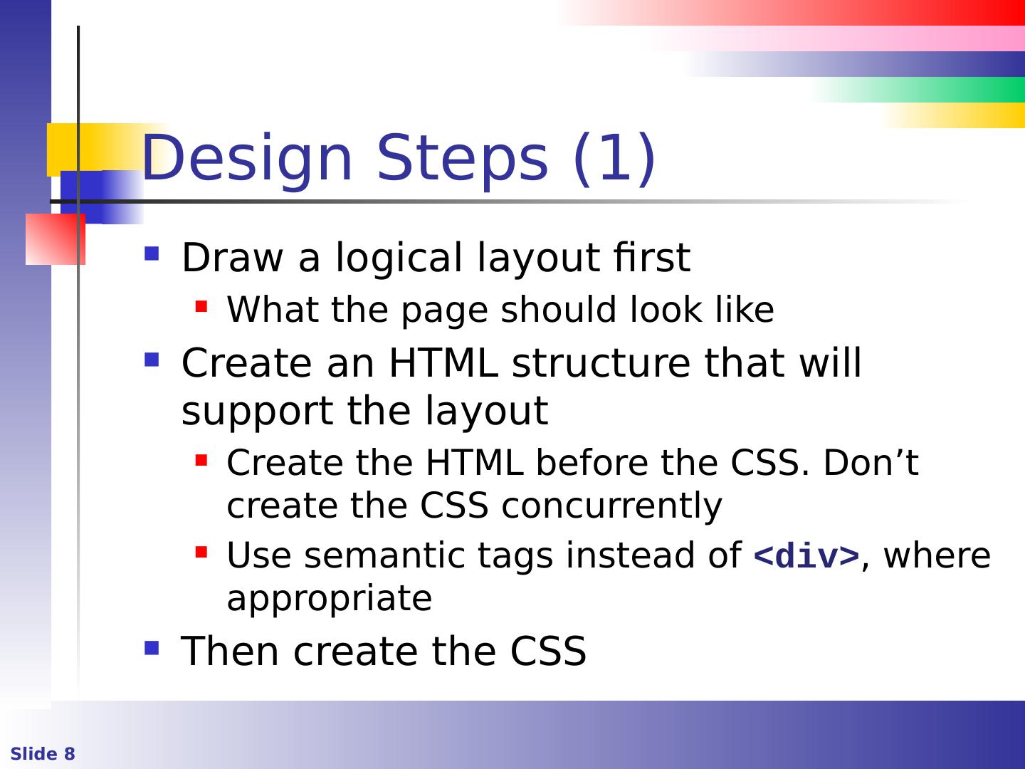
8 .Design Steps (1) Draw a logical layout first What the page should look like Create an HTML structure that will support the layout Create the HTML before the CSS. Don’t create the CSS concurrently Use semantic tags instead of <div> , where appropriate Then create the CSS
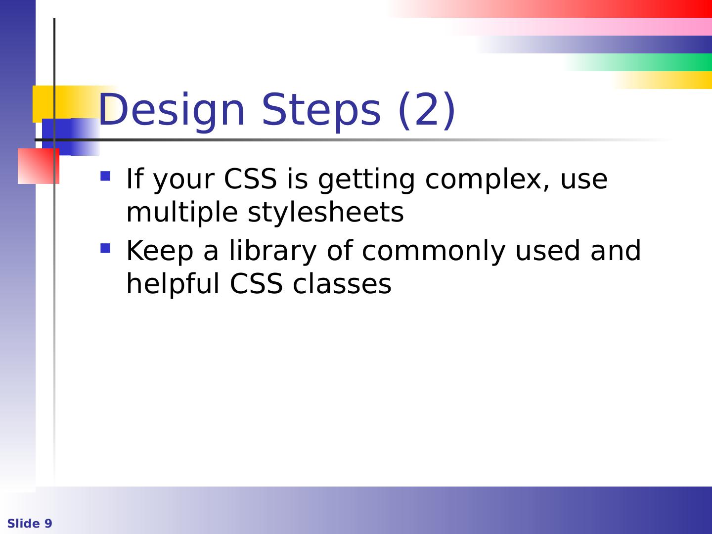
9 .Design Steps (2) If your CSS is getting complex, use multiple stylesheets Keep a library of commonly used and helpful CSS classes
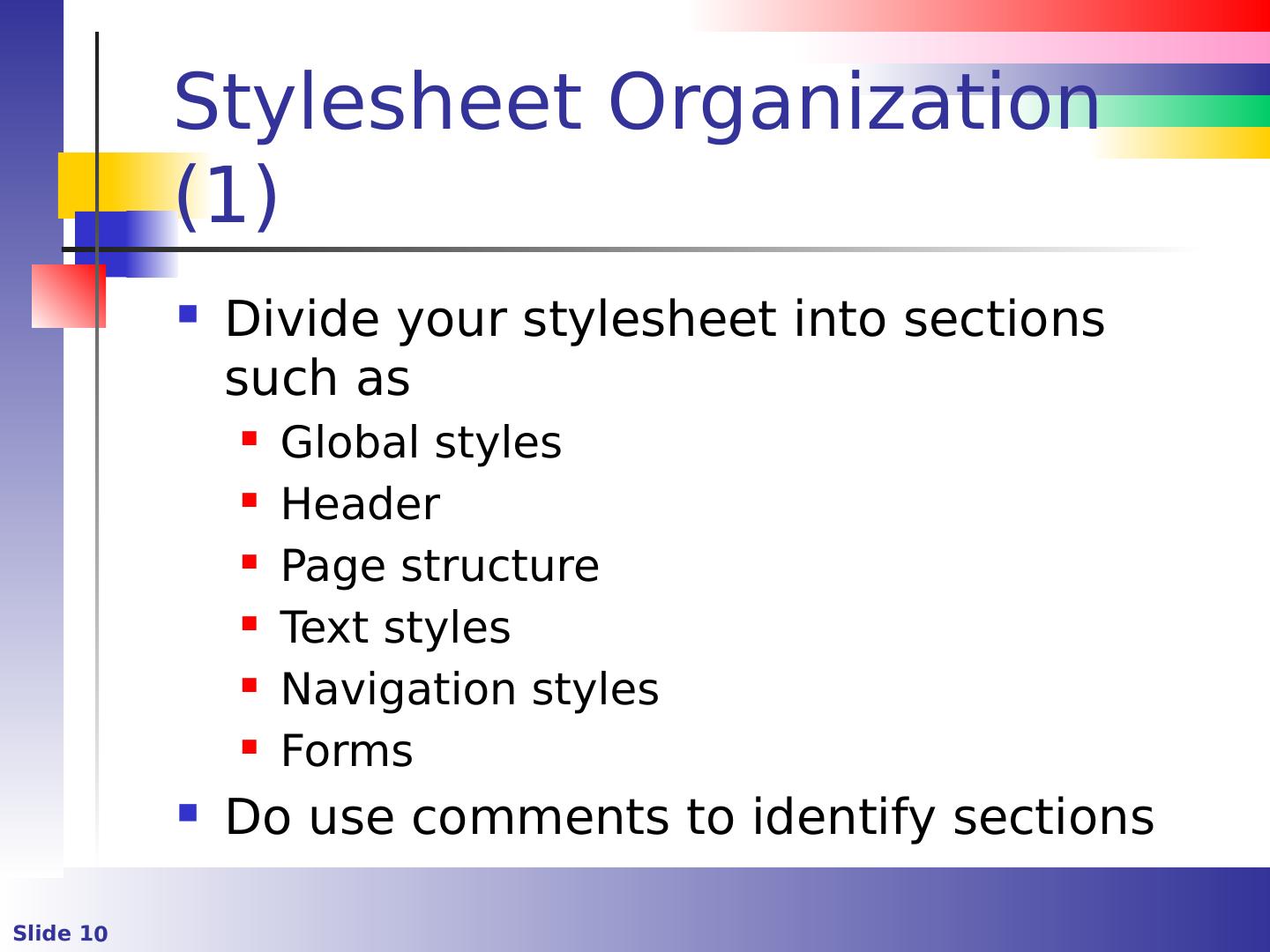
10 .Stylesheet Organization (1) Divide your stylesheet into sections such as Global styles Header Page structure Text styles Navigation styles Forms Do use comments to identify sections
11 .Stylesheet Organization (2) Don’t use inline styles except for development and testing Do use external style sheets They can be cached so pages load faster A single stylesheet can be applied to every page of a site This method separates content from presentation
12 .Fixed vs. Fluid Layouts A fixed layout has a wrapper that’s a fixed width The inner components are expressed as a fixed width or percentages A fluid or liquid layout is expressed in percentages
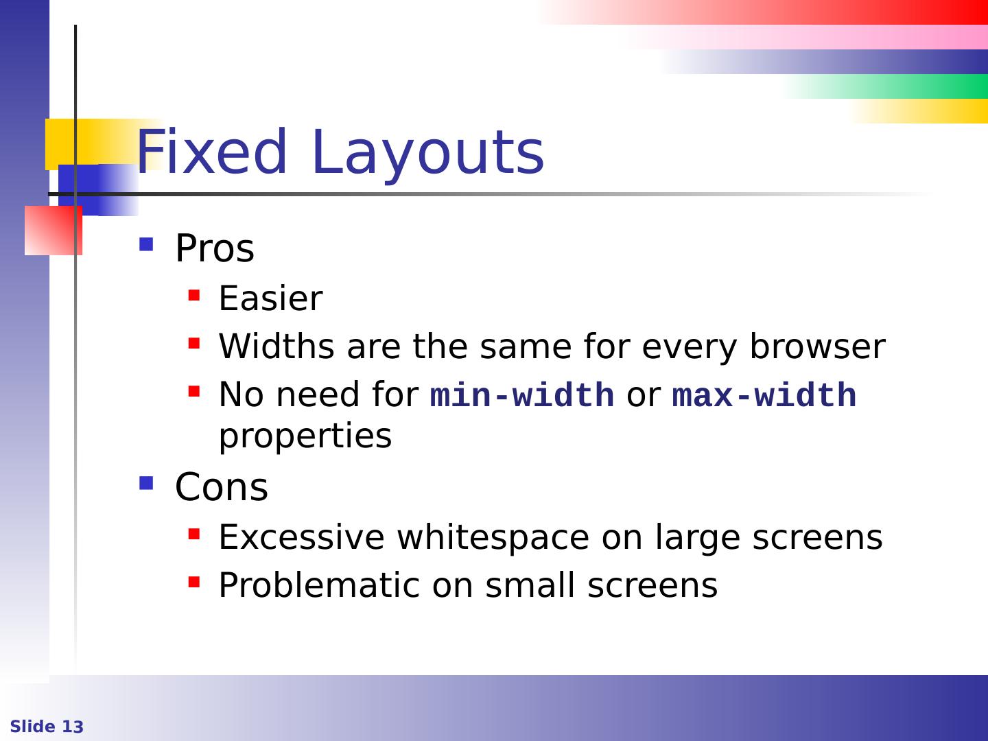
13 .Fixed Layouts Pros Easier Widths are the same for every browser No need for min-width or max-width properties Cons Excessive whitespace on large screens Problematic on small screens
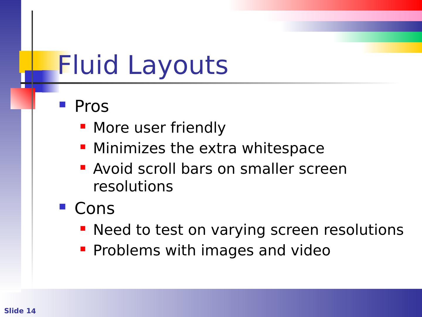
14 .Fluid Layouts Pros More user friendly Minimizes the extra whitespace Avoid scroll bars on smaller screen resolutions Cons Need to test on varying screen resolutions Problems with images and video
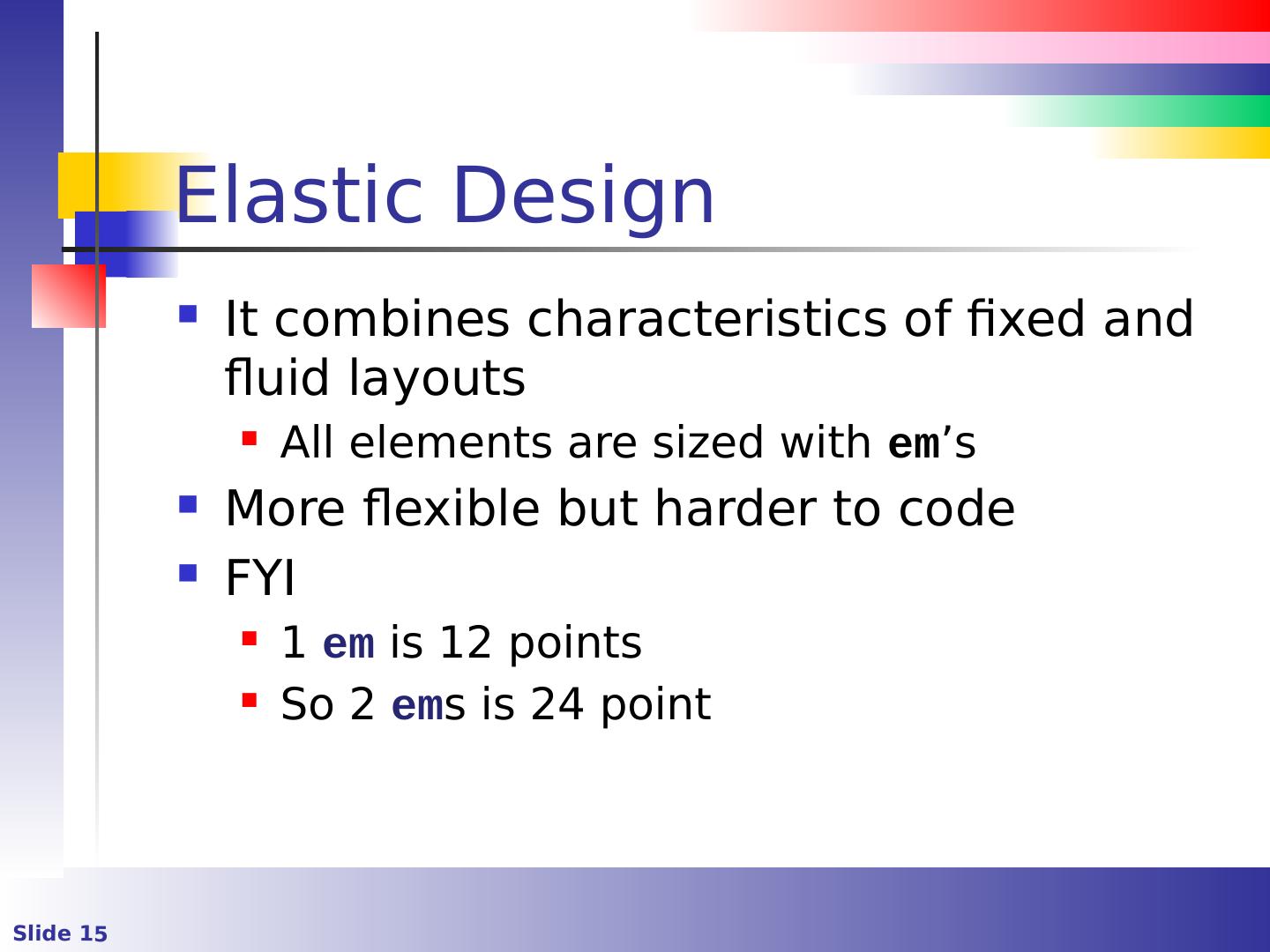
15 .Elastic Design It combines characteristics of fixed and fluid layouts All elements are sized with em ’s More flexible but harder to code FYI 1 em is 12 points So 2 em s is 24 point
16 .Color Keep a color reference somewhere in your CSS file The color reference is typically expressed as a comment in the CSS
17 .Some Best Practices Declare the most generic items first, and then the more specific ones This takes advantage of CSS inheritance Use intuitive naming conventions and think of future edits Avoid names like left and right as positioning might change later Use hyphens for class names and underscores for IDs
18 .Some Best Practices Divide stylesheets into sections Do use shorthand properties instead of detailed properties for brevity and efficiency margin:5px 1px 4px 10px; Is faster than margin-top:5px; margin-right:1px; margin-bottom:4px; margin-left:10px;
19 .Some Best Practices Don’t be repetitive and do reuse attributes
20 .Some Best Practices Minimize the use of IDs Avoid !important unless absolutely necessary Do use resets to override default browser formatting
21 .Existing Templates There are thousands of existing template Some free. Some not Pay attention to licencing Examples http://templated.co / http://www.free-css.com /
22 .Other Tools and Frameworks Bootstrap CSS Fluid and fixed versions Uses a 12 column 5 Flexible across devices http://getbootstrap.com/css / A list of frameworks http :// usablica.github.io/front-end-frameworks/compare.html
23 .Other Tools and Frameworks Less is a CSS pre-processor that extends the CSS language http://lesscss.org / SASS is another stylesheet language http://sass-lang.com /


